Billinghay Sawmill
Locally manufactured timber products for every project.
Details
A heritage-led rebrand for Billinghay Sawmill, a Lincolnshire timber business established in 1975, pairing a refined serif wordmark and a stamp marque inspired by historic timber grading marks with a palette drawn from the sawmill's own woods and machinery, so the identity feels crafted rather than corporate.
Services
Brand Identity
Web Design
Year
2026



The colour palette takes inspiration directly from the materials, machinery and environments found within the sawmill itself. Rich hardwood browns, muted sage greens, dusty blues and warm neutral tones combine to create a palette that feels grounded, tactile and premium. The palette is designed to be used with restraint. Rather than overwhelming the website or printed materials, the colours work best as subtle accents alongside strong typography, natural textures and photography.
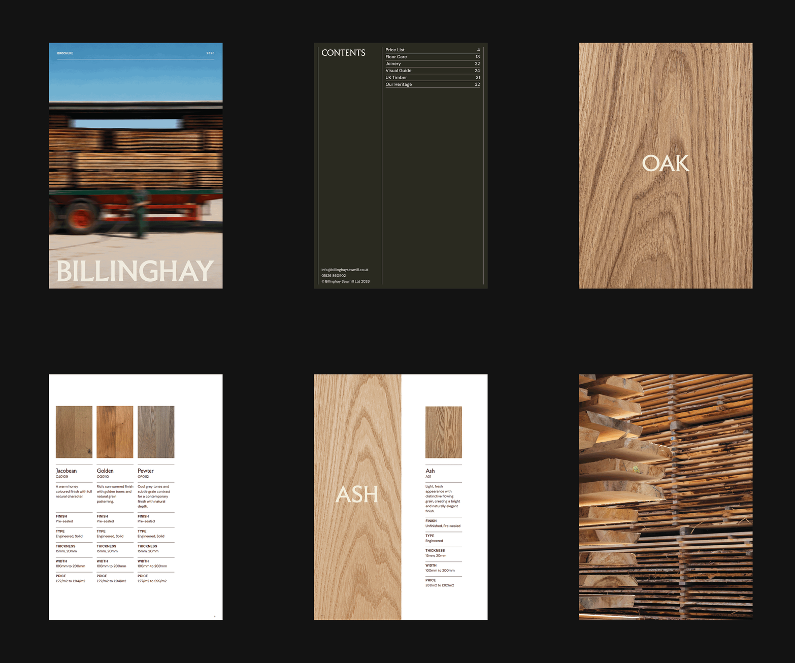
The pairing of typography, colour and photography creates a visual system that feels calm, premium and highly adaptable. The more restrained layout approach allows the materials themselves to become a central part of the identity. Even in minimal applications, the branding retains a strong sense of character and recognisability.
Applying the identity across physical materials helps bring the brand to life in a much more tactile way. The stamp graphics, muted colour palette and typography all work together to create something that feels crafted and considered rather than overly polished or corporate.